A scientist explains why you should approach exciting microbiome news with caution
We know the microbiome is important to health, but we're still developing the tools to understand how and why
You’ve probably heard about “the microbiome,” the trillions of bacteria and other microbes that live on and inside of our bodies in a microscopic ecosystem. This ecosystem plays an important role in bodily processes ranging from digestion to training our immune system. We know that some microbes or the wrong combination of microbes can cause diseases. For example, the yeast Candida albicans is commonly found in healthy vaginal microbiomes, but can also cause yeast infections when those microbiomes get out of balance.
The complicated relationship between the microbiome and our health has spurred an unprecedented interest in probiotic products from classic pharmacy shelf supplements and yogurt to newer (and pricier) skin care products, toothpastes, and deodorants. These products claim that they will improve your microbiome by boosting the “good” bacteria in your body. But the evidence behind such claims is often far from conclusive, and sometimes outright nonexistent.
Keeping up with the (over)hype
Unfounded claims about the microbiome have become so prevalent that University of California Davis professor Jonathan Eisen started handing out a cheeky “Overselling the Microbiome Award” on his blog to products and articles that get it wrong.
There’s no doubt that the microbiome is important to human health. To date, there have been 29,400 studies linking traits of the microbiome to diabetes, 25,800 to obesity, and 18,400 to allergies. Thousands of other studies have linked the microbiome to multiple sclerosis, depression and autism. A particularly striking study on malnutrition in Malawi found cases of identical twins on the same diet where one had malnutrition and the other did not. The only difference? Their microbiomes.
Because of studies like these, scientists are confident that a healthy microbiome is important to human health. The problem with the glut of probiotic health products in the marketplace is that although we know the microbiome is important, we don’t yet understand how or why it works.
A tsunami of data
Each person’s microbiome contains up to a thousand highly diverse species that come from many different families and interact with one another in totally unknown ways. Most of these microorganisms can’t be grown in a Petri dish, so scientists can't study them with older biology techniques. Instead, we can only identify and study these organisms by sequencing their DNA with newer technologies that have only recently become cheap enough to do at scale. As a result, the amount of raw data we have on the microbiome is growing quickly.
But while the sheer amount of data piles up, the theory for how to interpret the data is lagging behind. New developments in statistical theory are helping scientists make sense of all the new data. But like with all new ideas, learning to apply the right kinds of mathematical tools to biological data has led to a few false starts.
Adventures in bad math
One of the most well known findings about microbiome illustrates how poorly things can go if researchers apply the wrong kind of statistical methods to interpret their data.
In 2011, a team of scientists led by Peer Bork, collected and analyzed a large dataset of 39 individuals’ microbiomes. In their study, published in Nature, they claimed to find that microbiomes could be well categorized into three groups, which the authors termed “enterotypes.” These three types of microbiomes appeared to be unrelated to nationality, geography, or lifestyle. The differences between them appeared to not be continuous but clear cut, much like blood types.
The media was quick to pick up on the research and headlines included “You know your blood type. What about your gut type?” from Time Magazine and “Divided by language, united by gut bacteria—people have three common gut types” from Discover Magazine.
Categorizing microbiomes into three neatly defined types was an attractive idea: it meant that while the highly multidimensional variation in the microbiome might seem large and daunting, each person’s microbiome could be summarized by a single label, one of the three types.
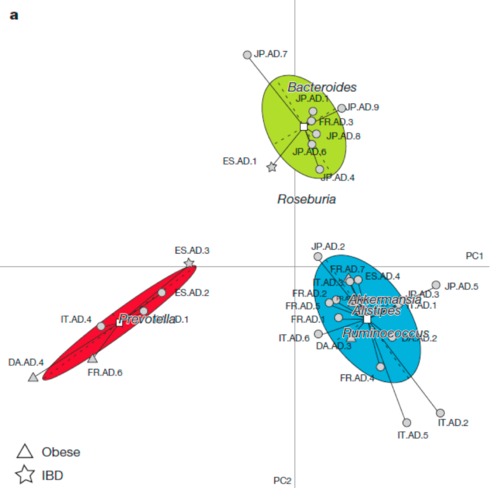
The findings resonated particularly strongly because they were visually convincing. Take a look at this figure from the study, which seems to show how participants’ microbiomes are grouped into three types.

In this figure, every point represents a person’s microbiome. This is a 2-dimensional representation a highly dimensional dataset.
Long after the headlines had faded, other researchers repeated the study and found they couldn’t replicate the findings. They didn’t find enterotypes in their own datasets and they also had difficulty reproducing the figure that supported the existence of enterotypes from the original dataset.
Criticism from the scientific community led Arumugam and colleagues to add an addendum to the original paper stating that their findings did not support the claim that the variation in the microbiome fell into three distinct types.
What went wrong?
In any given study, scientists have to make many choices about what analyses to run on a dataset and how to plot the results. This choice is particularly important when dealing with the microbiome.
Each species in the microbiome represents its own dimension in the dataset. Because there can be 1,000 species in any given microbiome, comparing the microbiomes of two individuals could involve statistical analysis with a 1,000 dimensional dataset. It’s impossible for humans to even imagine 1,000 dimensions, and the science for how to analyze such large datasets is still developing, too.
How to generate patterns out of noise
Two statistical methods came into play with this study: clustering and visualization. Clustering data tells us which points group together based on how close they are to one another in the highly dimensional space. Clustering is a common technique for analyzing large datasets. However, in this study the researchers used a clustering method that has a predetermined number of clusters. Essentially, they asked the algorithm to cluster the data into three groups, then reported that they found the data was clustered into three groups.
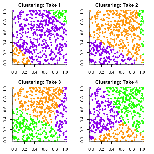
It’s easy to demonstrate the problem with this method. Here's what happened when I took a set of completely random points and ran it through a similar clustering algorithm to the one that was used by Arumugam, Raes, and colleagues.

Ilana Arbisser
Remember, the data is random. There isn’t any structure in it that suggests we should group the data into three clusters. But as you can see, the algorithm will return three groups no matter what and assign each point in the data to one of those groups. I ran this algorithm four times and colored the points by the clusters the algorithm returned. You can see that with each run, the clustering is completely different because there’s no true structure in the data.
The clustering algorithm alone doesn’t explain why the figure from the Arumugam, Raes, et al. paper looks so convincing. That comes down to their choice of method to visualize the data.
Data in another dimension
Visualizing a complex dataset involves taking many dimensions and reproducing them in a smaller number of dimensions. Even in a dataset with just a few dimensions, reducing the number of dimensions in the wrong way can lead to an misleading interpretation of the data. Take a simple case of representing a three dimensional teapot in two dimensions. If you just saw the middle or right photo in the figure below, you’d probably have a hard time recognizing it as a teapot. The photo on the left gives us much more information about the teapot’s structure than the other two images.

This problem becomes more pronounced when you start working with higher dimensional objects – in this case, a dataset with thousands of dimensions.
Arumugam, Raes, and colleagues used a particularly unusual method for illustrating their data in two dimensions. Most of the algorithms used for visualizing data in two dimensions try to represent the dataset like the teapot photo on the left – with the most variation in the data possible. Arumugam and colleagues, however, used a method which represented the data in the way that maximized the space between the clusters.
Given this visualization method designed to separate clusters, and the clustering algorithm they used that would spit out three distinct clusters no matter what, it’s no wonder they reported that they found three, well separated, microbiome types.

A research group at UC Boulder created a random dataset based on computer simulations of microbiome models and showed using Arumugam’s team’s methods that it’s possible to group random data in three seemingly distinct clusters.
The case for statistics
My point isn’t that Arumugam and colleagues were doing bad science, but to illustrate just how large and tangled the data for the microbiome is. The sheer number of microbiome studies has exploded in the past few years. But the science behind the microbiome is so new that the best methods for analyzing the data are still being debated. The choices we make about how to measure and interpret the complex world of the microbiome will determine what we can understand about why some microbiome compositions can lead to illness in people and how we can make them healthier.
The good news is that the fields of statistics, computer science, and applied math are making progress developing methods for analyzing large data sets. Machine learning, for example, is a field of study focused on highly dimensional data and researchers are applying some of these methods to the microbiome. These cross-disciplinary applications highlight the importance of communication between these fields. To tell the right stories, we need statisticians, applied mathematicians, and computer scientists who create the analyses and algorithms for multidimensional datasets to interact with the scientists who collect that data and ask the biologically relevant questions.
There’s still an astounding amount we don’t yet know about the microbiome. But the evidence suggests that the more we understand how to analyze the data, the more we’ll learn about this tiny, yet complex world, and truly understand how to improve the health of our microbiome.
Featured Paper
Arumugam M, Raes J, et al. "Enterotypes of the human gut microbiome." Nature 473.7346 (2011): 174-180.
